Beebom
Rating7
One UI 8 is a refined, polished upgrade that adds a bunch of quality-of-life changes that will improve your One UI experience in the long run. However, there is nothing truly substantial to blow you out of the water, unless you are running an older version of One UI and have never received the One UI 7 update.
Pros
- Lots of small quality-of-life improvements
- Samsung DeX feels on par with Windows
- Stable performance with polished animations
Cons
- Not enough prominent changes
- Now Bar and Now Brief need more functionality
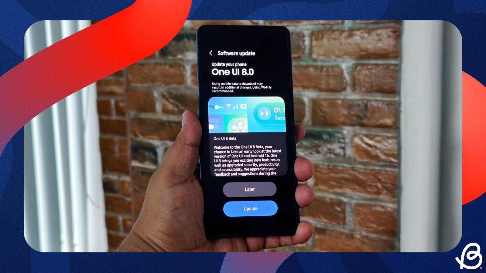
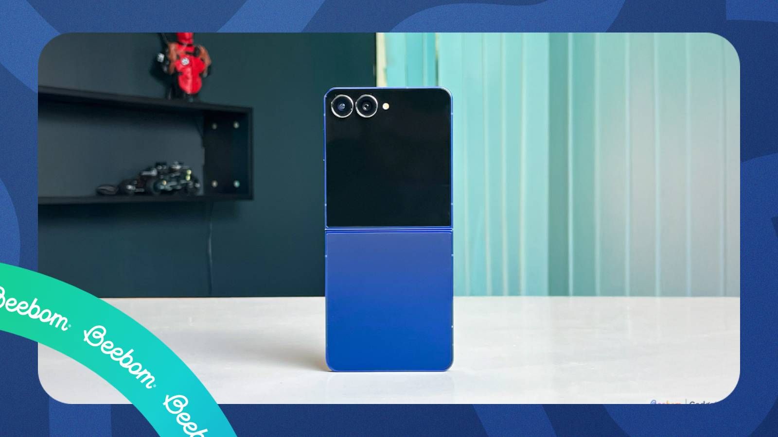
With One UI 7, Samsung reinvented its smartphone operating system in a big way. But before the update could even arrive on most of its Galaxy phones, the brand introduced One UI 8 with further improvements and changes. Now that it’s finally here, the big question is: does One UI 8 actually deliver the refinements and stability Samsung promised? I’ve been using One UI 8 on the Galaxy Z Flip 7 for nearly three weeks, and let me share the truth in this review.
Minor changes that go a long way
When I first booted the Galaxy Z Flip 7 after updating to One UI 8, I honestly questioned which version I was on because it looked just like One UI 7. There were no in-your-face redesigns or flashy changes to distinguish One UI 8 from the previous version. But I guess that’s the point. One UI 8 isn’t about the aesthetics, because we already got them with One UI 7.
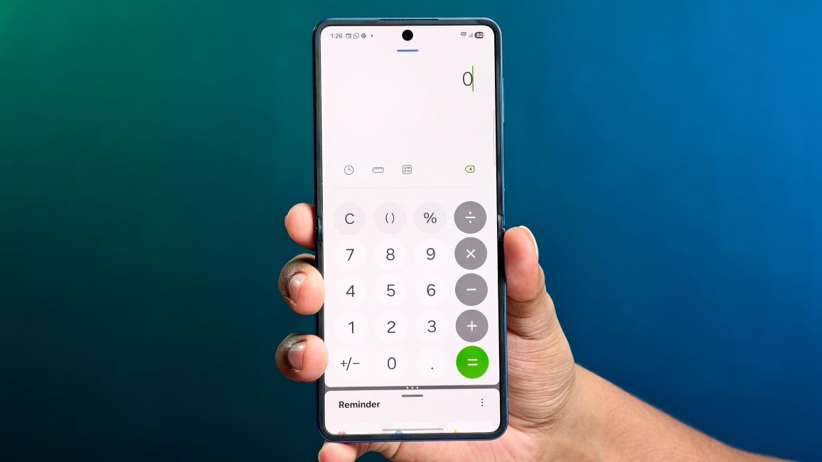
It is about useful improvements like the 90:10 split-screen mode, a thoughtful upgrade that lets you keep one app dominant on the screen while the other stays tucked away at the top or bottom. This makes it perfect for using apps like Calculator along with banking apps to calculate my expenses, or with WhatsApp and Reddit to quickly share links from one app to another. It is a minor change, but something that I have started to use more and more lately on the Z Flip 7.
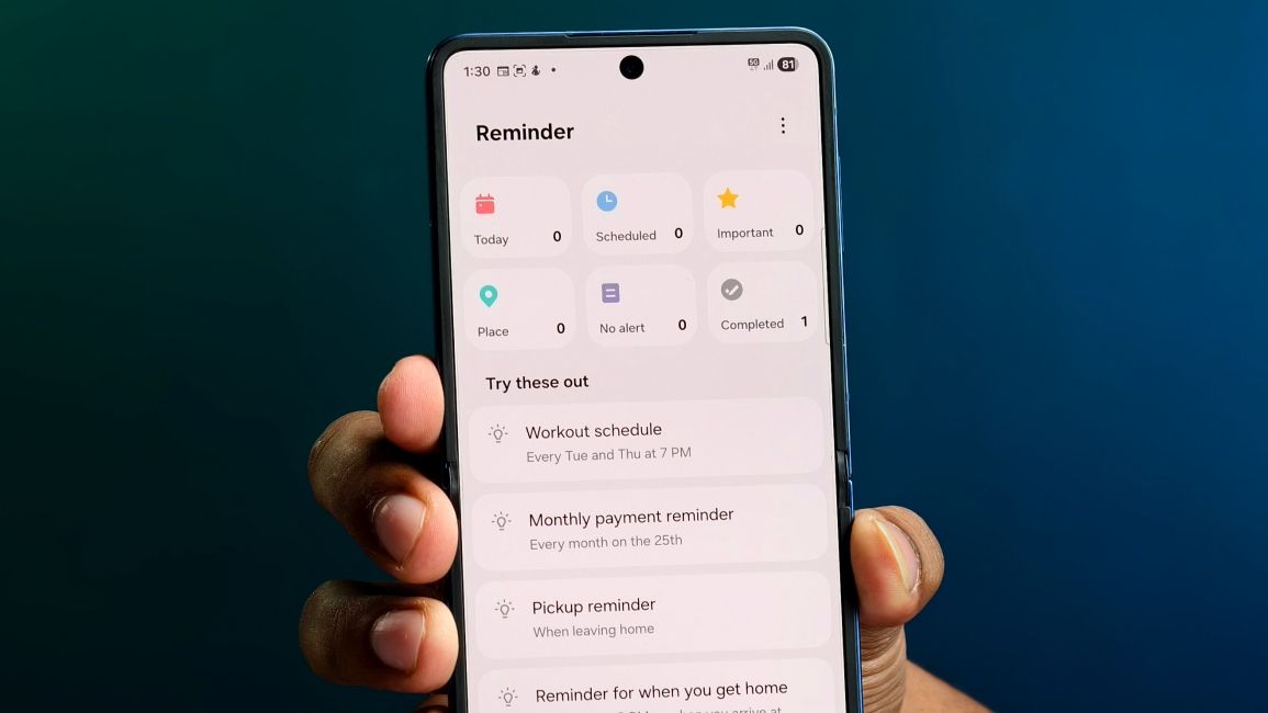
Then there are changes in the Samsung Reminders app, which I typically don’t use since I rely on Google's suite of apps. But for the sake of One UI 8, I gave Samsung Reminders a shot, and what an upgrade it has been. It shows all my set reminders at the top, so I know what all things I have to deal with and also syncs reminders with the Calendar now, which was a much-needed addition.
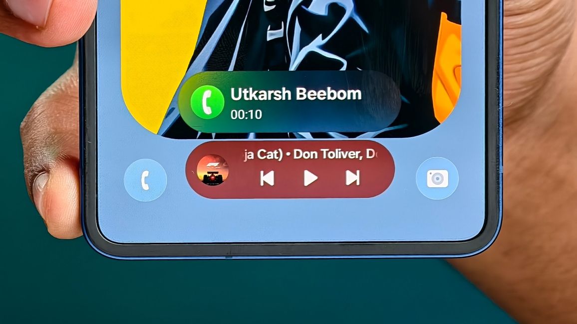
The Now Bar shows ongoing and incoming call notifications. The Files app shows recently downloaded items and which app they were downloaded from, and you can now hide apps in Secure Folder. These are the small yet handy changes that I liked, and One UI 8 is riddled with more such conveniences.
The all-new Samsung DeX experience
If you are a Samsung DeX power user, then there are some serious new changes in store for you with the One UI 8 update. Samsung has given DeX a much-needed facelift that fits more consistently with the rest of its user experience, and also feels like a proper desktop OS like Windows 11 or macOS.
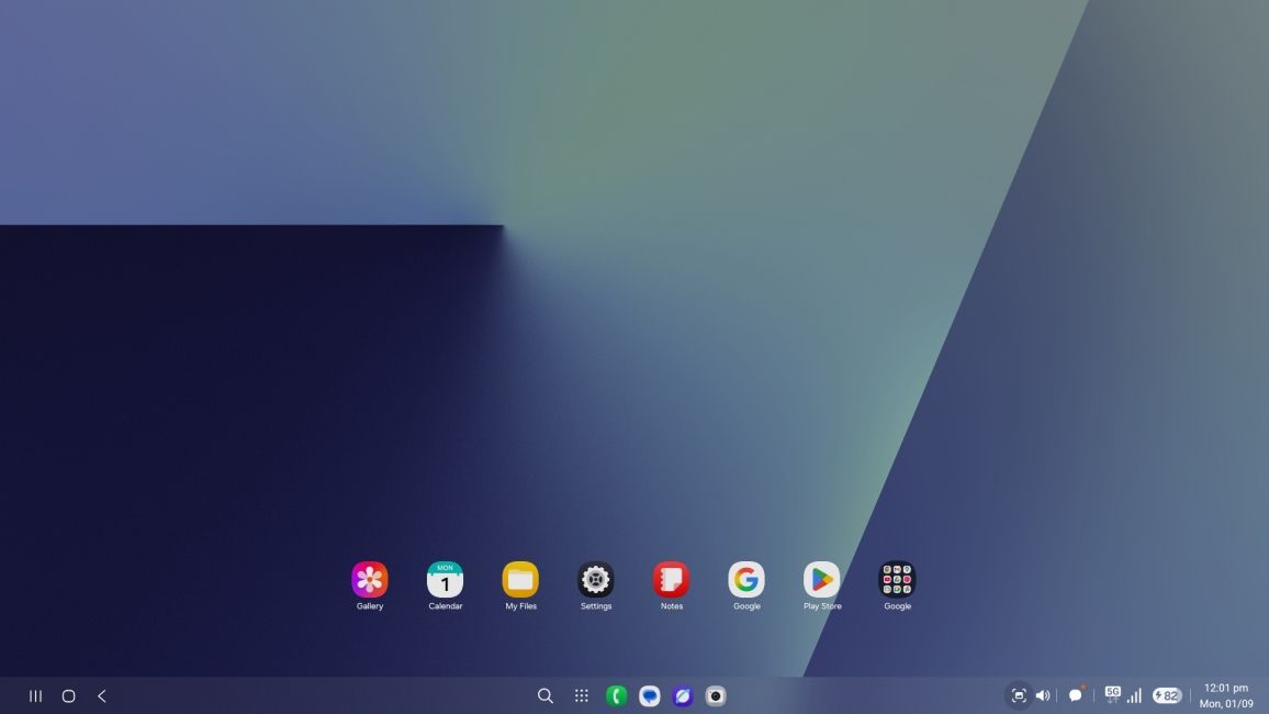
Why do I say that? Well, there's a persistent dock at the bottom to quickly access your frequently used apps. The app drawer and the Search option have been shifted to the centre, much like the Start button in Windows. Opening the app drawer doesn't take up the whole screen like it used to, and apps and folders now open with a single left mouse click.
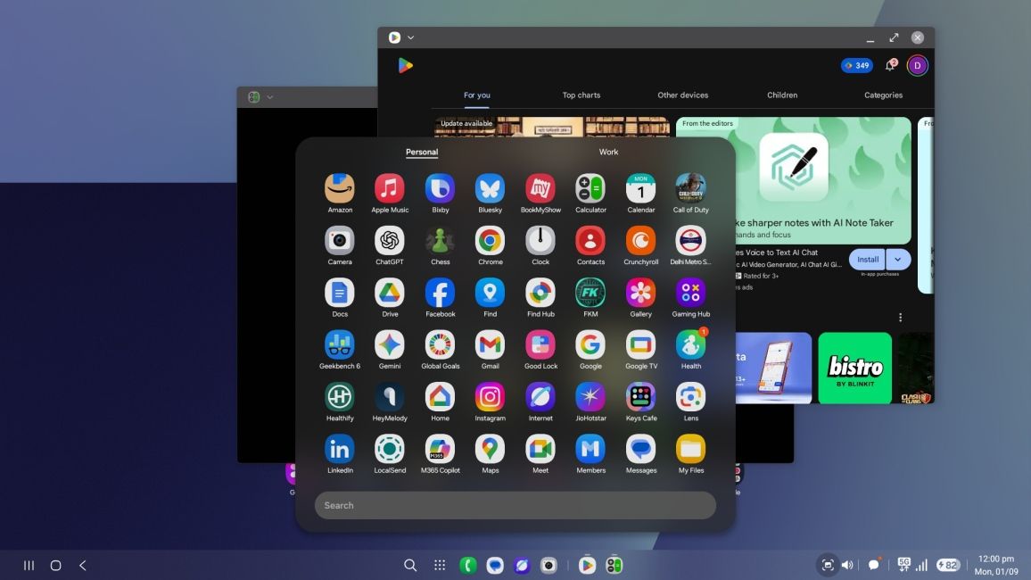
This all felt more natural to use since this is kind of the interface I am familiar with on my laptop. Heck, Samsung has even added a button to quickly snap windows to either the left or the right side, to have two apps open side by side. And if, for some reason, you are using DeX with multiple monitors, you rotate the screen or change the resolution as well.
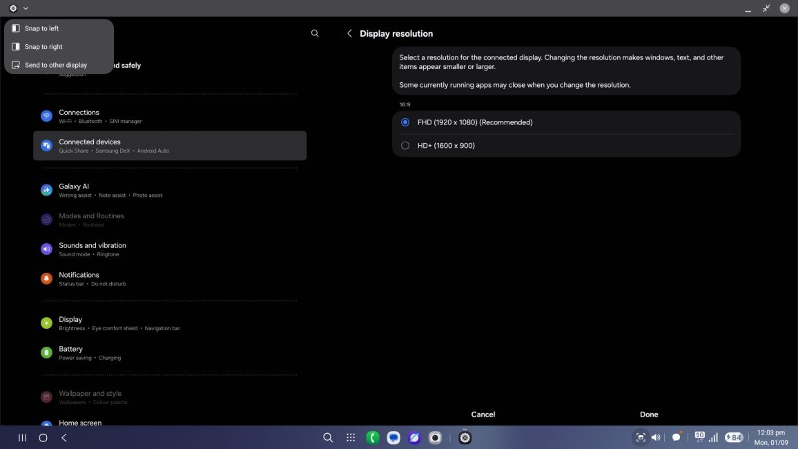
I see they are taking a lot of notes from Windows, but I am not complaining. This new DeX on One UI 8 feels more functional as a desktop OS. And there aren't any odd hiccups here either, which is why it now feels more like a natural extension of One UI than a tacky add-on like before. But that's my opinion on it.
Stability that finally feels polished
As I mentioned at the start, I have been using One UI 8 for three weeks now, and besides everything I have described in this review, one thing that stood out the most to me is how stable the software feels. I’ve rarely run into any bugs worth mentioning, which is a big shift from the occasional hiccups I had with One UI 7.
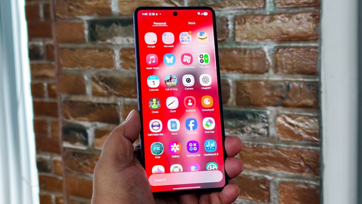
I used One UI 7 on the Samsung Galaxy S24 Ultra, which was a flagship device, and compared to that, my experience with One UI 8 on the Z Flip 7 has been much more pleasant. Animations feel smooth, and don’t cut off midway like they sometimes did in the last update.
Whether I’m pulling down quick settings, opening the app drawer, jumping into recents, or just launching and closing apps, the whole UI feels snappy and slick. Even the day-to-day battery life is more consistent because of it. Everything here comes across as more refined and complete, like Samsung finally ironed out the rough edges with One UI 8.
A big number, but not a big leap
For all the polishes One UI 8 brings, it doesn’t quite feel deserving of a full-number jump from 7 to 8. If anything, it’s closer to what I’d call a One UI 7.1 or 7.5 update. Don't get me wrong, the changes are nice to have, but they don’t scream "major version upgrade".
I mean, there are areas where Samsung hasn't pushed things forward. Like the Now Bar. Sure, it’s gotten some upgrades, but it still feels miles behind Apple’s Dynamic Island. It can’t show live status from third-party apps yet, which is a huge miss, especially now that Android 16 natively supports live updates. Even OnePlus’s Dynamic Pill alternative feels better thought out than the Now bar.
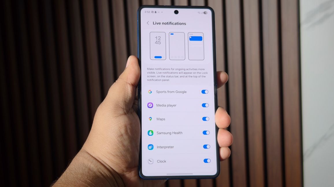
Then there’s the Now Brief, which continues to be a half-baked idea. Outside of giving me the weather, it hasn’t once provided genuinely useful information to start my day. If I really needed a quick weather check, I’d just use a widget or open the app.
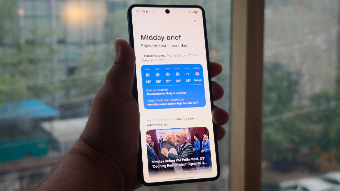
I had to really dig out what the "New" is here with One UI 8 for this review, and it is just not enough. I understand the reason why it feels so lacklustre, because Samsung was racing against the clock.
They were already too late with One UI 7 and waiting for more features would have just pushed them back further. But I can’t shake the feeling that this is not the kind of leap forward the “8” in its name suggests.
Samsung One UI 8 Verdict: More polish, less punch
After spending time with One UI 8, my takeaway in this review is pretty straightforward. If you’re jumping straight from One UI 6, this update will feel big. It’s a much more polished take on One UI 7, with smoother performance, fresh touches across the interface, and enough refinements to make it your favourite version of One UI yet.
But if you’re already on One UI 7, the story changes. Beyond the stability boost and a few small touches here and there, you won’t notice much. The new additions do add quality-of-life improvements to everyday use, but they are not substantial enough to warrant a full-number leap. But who knows, Samsung could improve One UI 8 as the year progresses with further updates.
