Apple revealed its Liquid Glass design, making it of the biggest UI updates to iPhone since iOS 7. According to the Cupertino giant, Liquid Glass, as the name suggests, brings transparent elements to the UI which makes the UI visually pleasing to look at. However, after iOS 26 Developer Beta, users don't appear to be happy with the UI.
The premise of this growing criticism is related to readability and ease of use, taking a backseat. One of hit posts on X was from user @greggertruck who posted an image of the new Liquid Glass UI in control centre overlapping with the home screen, and said “Steve Jobs would have fired everyone”.
Steve Jobs would have fired everyone pic.twitter.com/UsiCu6j07u
— Greggertruck (@greggertruck) June 9, 2025
The post garnered over 20 lakh impressions, with users criticising Apple's new UI direction. One of the users commented that “It feels like things are going to be harder to read with this new design,” while others are hopeful Apple fixes Liquid Glass' quirks because it's an early developer beta.
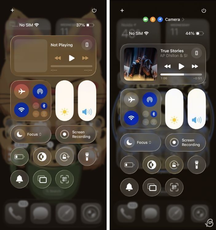
There were a few users who did praise the UI, saying it looks futuristic and different. However, most claimed the text appears completely illegible as it tends to blend with the background.
Beebom Gadgets Take
But is it too soon to judge a release from its first Developer Beta? We think it is. It's a long departure from Apple's conventional UI, or any UI for the fact. However, Apple clearly needs to tweak a few things to make it a bit better.
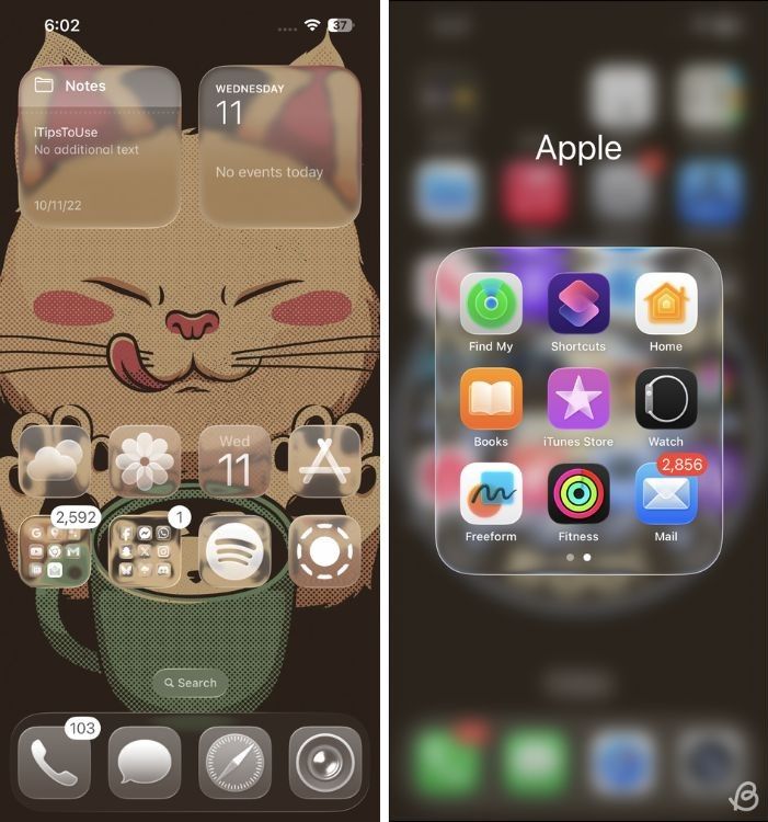
The glass effects in notifications, Control Centre and home page blend a bit too well with the background. So unless you use a solid background, you will need to squint your eyes. But on the bright side, the glass effect does at a bit more character in some regions of the OS.
It's clear that Apple needs to add a bit more Gaussian blur across the UI to make it a bit more legible and easy to navigate. If Apple does decide to stick to the current layout, it would spill disaster for the UI.



.png)
