A refreshed logo helps brands stay relevant and evolve with the times and it seems Google thinks so too. The company has now added a splash of new colors and made a few subtle design tweaks to its Gemini logo.
While the tech giant hasn’t made much noise about it, there are hints of near-official confirmation. For starters, if you take a look at the official Google Gemini App X handle now, it showcases the new logo design in the display as well as the cover picture.
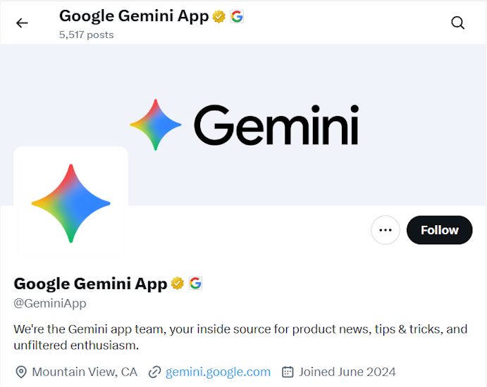
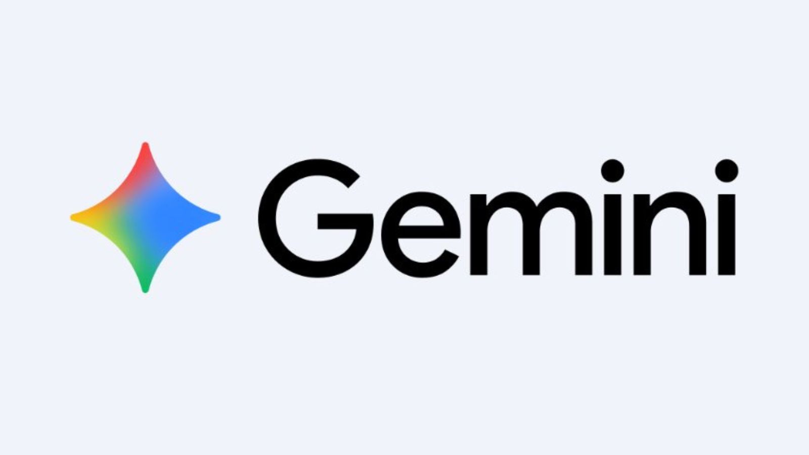
The Gemini "star" was previously infused with blue and purple hues. Now, we see shades of red, yellow and green bleed into each other on the left, while the blue is retained on the right. So, in essence, it now adopts the same color palette as Google’s own logo.
Moreover, the logo is now more rounded off to give it a more docile look. However, it might not just be the logo that gets these new colours.
Google's official About Gemini page has given us a good insight into what's to come. Not only does the website now reflect the new Gemini logo colours, but it also hints at the Gemini mobile assistant getting a similar makeover.
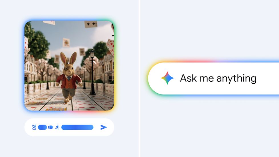
The "Ask Gemini" floating panel which appears upon long pressing the power button on your Android devices is seen to embrace these new rainbow colours at the borders.
Additionally, when generating images through Gemini, these generations are also shown to have the same vivid colours at the borders.
If you ask me, the new Gemini logo does look more colourful and is a refreshing change. I'm also really looking forward to seeing it in action across the board. While Google has not revealed anything yet, expect to see the redesigned logo and its colours to roll out gradually over the coming days.




.png)
