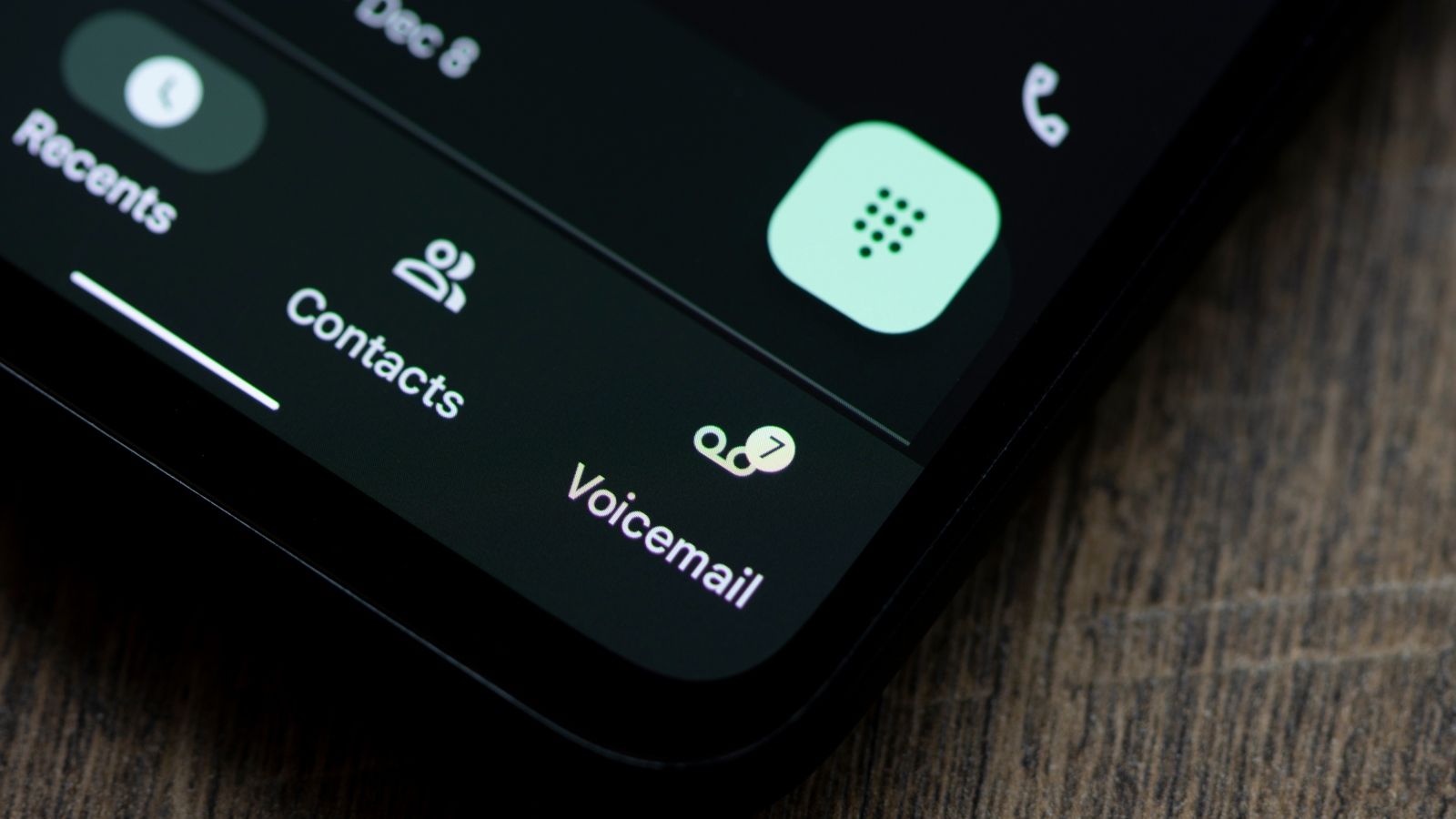
Google Phone finally appears to be getting a Material 3 Expressive redesign, marking it as one of the biggest UI revamps the app has seen in years. The update changes many aspects of the app, from the home screen interface to the caller interface.
Google is rolling out Material 3 Expressive UI for its Phone app for those enrolled in the app's beta channel. Spotted first by 9to5Google, the first evident change is the borders around the contact names in the Recent tab. This design language follows as you tap on a contact to expand for more options.
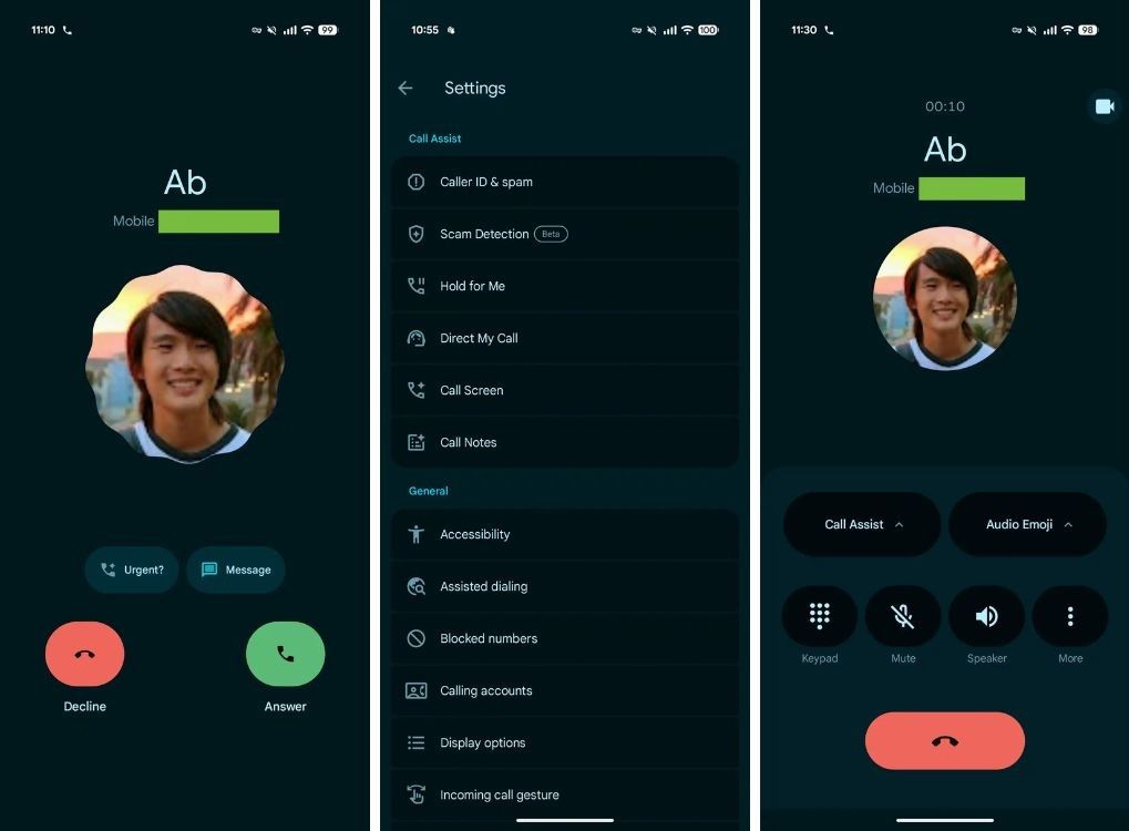
Next, the Phone app's Settings screen also leverages Material 3 Expressive's design, with each section being easily distinguishable thanks to visible borders and contrasty backgrounds. Lastly, the upgrade to the live call screen is the biggest, as Google seems to have ditched vertical swipes to pick up or end calls for two different layouts.
These are similar to iPhone's horizontal swipe gestures or buttons. The interface changes follow once you pick up the call, where all the options are now pill-shaped, not perfect circles.
Google Phone is not the only app getting Material Expressive changes. Recent leaks from Android Authority reports that Pixel's At a Glance widget might be getting a much-needed revamp, adopting features from Samsung's Now Bar and could change the default position of the widget to the bottom.
Material 3 Expressive is still under testing, with Google rumoured to roll it out to Pixels running Android 16 as soon as early next month. It revamps Android completely with a fresh new user interface, tighter and nimble animations, and a few new features. Google apps on Pixels and Wear OS are already getting new Material 3 Expressive UI changes, including Messages, Maps, Calendar, and Keep.





.png)
