


Google is reportedly preparing a major redesign for the Google Translate app on Android. The app could get a redesigned home screen, a new navigation system and a cleaner layout that makes its growing list of translation features easier to access.
Google Translate to Get a Revamped Home Screen and Navigation
Folks over at Android Authority dug deeper into the Google Translate app version 10.25 to uncover the upcoming UI refresh. The most prominent tweak is the new pill-shaped navigation bar, which is now positioned at the bottom of the screen.
It features four tabs – Translate, Live Translate, Camera and Practice. For those unaware, the Practice panel lets users make use of an AI-powered Pronunciation Practice Tool on Google Translate, which was added just in April 2026 to celebrate its 20th anniversary.
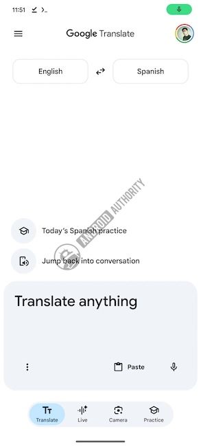
Moving on, the Language selection options have been shifted to the top to reduce visual clutter and free up space. The primary translation text field has been relocated to the bottom as a card, alongside other quick actions such as the microphone button, a paste shortcut and a 3-dot menu.
Additionally, Google is also adding contextual shortcuts above the input field, allowing users to resume language practice sessions or jump back into recent live conversations.
Besides, the save icon is being replaced by a standard hamburger menu, which opens an activity hub, consolidating saved translations, past transcripts and translation history.
The Google Translate app redesign extends to other parts of the app as well. The text input screen is said to feature larger, rounded cards for improved readability.
Meanwhile, recent translations will appear directly inside the input card as users type. The final translation results page will also separate the source text and translated output into individual cards for a cleaner viewing experience.
Currently, this Google Translate app redesign is in development and we don't have a confirmed timeline for a public release. However, given how complete the UI already appears, we'd like to believe the revamp should roll out very soon.
Related Articles


