


Oppo officially launched ColorOS 17 on September 17 at its Developer Conference (ODC26) in China. It's based on Android 17 and brings a lighter and glassier look with new performance engines. In addition, there is a stack of AI tools and deep integration with your watch and earbuds. The stable update is already rolling out in China and the open beta is now live in India. On that note, here are the ColorOS 17 features.
ColorOS 17 Features
Take a look at every major ColorOS 17 feature that Oppo has announced including the new Fluid Design to the AI upgrades.
Related Articles

A Global Floating Island Navigation
The most notable change is the global floating island navigation bar. ColorOS 16 kept the navigation bar to the bottom edge, but on ColorOS 17, the navigation bar is free. It's transparent, pill-shaped and floats over your content.

According to Oppo, almost every first-party app has got this treatment including Files, Photos, Phone Manager, Compass and Notes. On top of that, testers have found the floating navigation bar inside Timer, Audio Recorder, Maps and the Media Player.
Next, ColorOS 17 surfaces whatever is running in the background into tappable capsules. That is a big reason the whole UI feels airy.
Related Articles

Fluid Design and Fluid Animations
Oppo has given the whole redesign an official name and it's called Fluid Design. It's meant to keep visuals, animations and touch feedback consistent across the system. It was first seen with the fluid motion idea Oppo tried with ColorOS 16.

Next, you can drag something and it stretches, move fast and it squeezes. You can let go and it snaps back into shape. The interface behaves less like flat glass and more stretchy. The lock screen island, notification panel, app search and the new floating bar all move in sync.
It even understands how you are touching the screen. A short flick gets a fast response, while a slow drag pushes back with a little resistance to match your touch pace. There are two new pieces powering it: the Aurora Engine, which is part of the rendering pipeline and Fluid Animation, which handles the transitions.
Related Articles

A Frosted-Glass Makeover
The look Oppo is going after is a frosted-glass liquid acrylic style. Across ColorOS 17, the translucent elements turn up everywhere from the Media Player and Control Centre to Notes, Files Manager and the lock screen. In addition, a "Contour Glow" adds a soft 3D outline around cards and whatever you have selected.

Next is Progressive blur, where different layers of the interface blur by different amounts to give a sense of depth. In fact, Oppo has added it in nearly every stock app. If all of this appears as ColorOS 17 taking a few design cues from Apple, well, that is exactly what is happening here.
Earlier, ColorOS Design Director Chen Xi played down on iOS-style Liquid Glass clone and Oppo has indeed dialled back the heavier refraction, but you can't deny that it looks a lot like iOS 26's Liquid Glass design language. That said, ColorOS 17 consumes less power and keeps text readable.
Related Articles

A Rounder and Glassier Control Centre
While ColorOS 16 brought rounded squares, you now get fully circular toggles in ColorOS 17. In addition, redesigned settings, edit buttons and a media player widget have gone round as well.
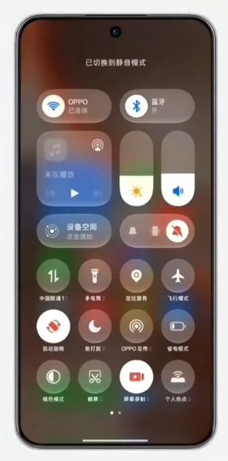
The panel behind the control centre turns translucent with the same contour glow and the brightness and volume sliders have that rounded touch. You can flick between the Control Centre and the Notification Centre and the two layers bounce apart.
Related Articles

New Lock Screen Clocks and Home-Screen Widgets
On the ColorOS 17 lock screen, the big clock brings three font styles and Oppo has finally added a colon in between the hours and minutes. It also gets the frosted glass finish and contour glow effect.
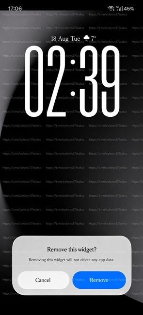
Apart from that, the Flux clock styles are not stuck on the lock screen. You can pull them onto the home screen as widgets. The lock screen work was started with the ColorOS 16.1 update earlier this year and now, we are finally seeing it in action.
A Redesigned Phone App
The Phone app has been updated on ColorOS 17 and it gets the floating bar and a completely redesigned dialler.
You can also swipe up to take the call and swipe down to end it. Best of all, you can flip those directions according to your preference. Not to mention, the old Answer and Reject buttons are still available for anyone who would rather tap. Finally, there is a toggle for whether Live Alerts pop up while the phone is unlocked.
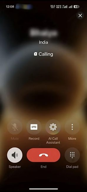
By the way, an AI Call Assistant is now available on the call screen, which means on-device AI is available during live calls. Oppo has also added AI Call Anti-Fraud, which flags suspicious callers in real time.
Faster and Lighter: The New ColorOS 17 Engines
With ColorOS 17, Oppo has rebuilt the core with a set of new engines. First off, the Aurora Engine is about efficiency and Oppo claims it reduces app start-up and runtime memory use by 25% and drops the rendering workload by up to 30%.
Next, there is the Tidal Engine, which learns how often you use apps, for how long and why. After that, it assigns system resources to match your usage. Oppo says it delivers 55.6% better background app retention compared to ColorOS 16.
In addition, you get 50% faster scrolling and loading in third-party galleries and 15% faster app switching. On top of that, Oppo is promising up to six years of fast performance on eligible phones.
ColorOS 17 Brings a Massive AI Upgrade
ColorOS 17 is pushing hard on AI integration. The new AI Photo Editor can remove objects, cut motion blur and fix colours and tones in photos. It's powered by a Da Vinci Engine with six models handling framing, lighting, colour, subject detail, exposure and sharpness.
There is also an AI Memory Gallery that combines your random shots into photo stories with AI-written captions. Next, an upgraded AI Notes listens and takes notes during meetings and builds structured knowledge maps. Oppo AI now works with Oppo earphones to translate a conversation in real time.
Do note that many of these AI features rely on Chinese services, so the global version of ColorOS 17 may not get all of them.
Status Bar Tweaks and Other Changes
When you read from the right, the status bar now shows the battery first, then Wi-Fi and then your signal icons. If you have two SIMs, you can integrate those signal bars into a single iOS-style block or leave them side by side.
In addition, app folders look more transparent with the blurred glass touch. And the charging animation now shows a glowing battery bar. Finally, the torch opens into a full-screen page and you can set the brightness by sliding it.
ColorOS 17 Release Date and Open Beta
In India, the ColorOS 17 open beta went live on October 9 for the OnePlus 15, 15R, 13, 13s and 13R, along with the Oppo Find X9, Find X9s, Find X9 Pro and Find X9 Ultra. Applications are open till October 12 and only select users can get in.
To apply, go to Settings > Software & update > Software update, tap the 3-dot menu and select Beta program. Now, choose ColorOS 17 Open Beta, accept the terms and tap on Apply.
As for the stable release, the ColorOS 17 global launch is expected on October 13. By the way, Oppo has not shared the stable rollout schedule for India yet.
In case you are unaware, OnePlus is phasing out OxygenOS and Realme is retiring Realme UI. Both brands are now adopting Oppo's ColorOS. If you want to understand what is happening with the shift, we have written an explainer on OxygenOS and Realme UI merging into ColorOS separately.
For the complete list, check out our guide on every ColorOS 17 eligible device and the dedicated list of OnePlus devices eligible for ColorOS 17. In any case, ColorOS 17 is the first release where the unified OS will be shipped to all three major brands.


