





The iPhone Duo is here, and it has received a mixed bag of reactions upon its launch. Most of the noise has been about the price, as Apple's first foldable phone costs an outrageous Rs 2,99,900 in India. But that is not the only thing people have been talking about. No, it has nothing to do with the specs or comparisons with existing Android foldables. What's actually been filling up my X feed is the animation.
The One Thing Everyone Is Watching on Loop
When Apple revealed the iPhone Duo, they showed a very subtle animation when opening the phone. It does not abruptly cut from the outer screen to the inner one. Instead, it stretches and pours itself across the large inner display with a progressive Gaussian blur.
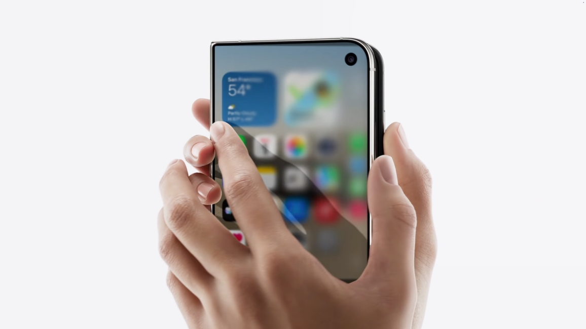
It is such an elegant but mesmerising transition that you can't stop looking at it. It's so relaxing that even I kept watching it on repeat. Since the iPhone Duo's launch, every reel, post, and discussion I have seen about the foldable has been about this animation.
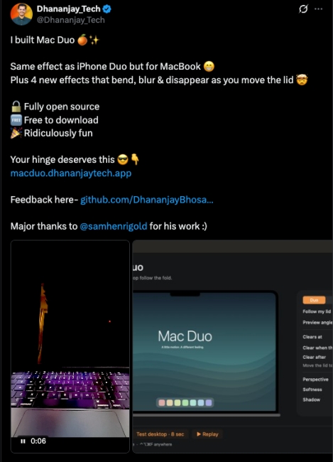
Folks on X have been so enamoured with it that people have taken it upon themselves to recreate it on every piece of tech they can. I have seen a Reddit user rebuild the same blur effect on their Galaxy Z Fold 8; someone on X vibe-coded an app that lets you get the same effect on your MacBook too.
Related Articles

The Crease That Almost Isn't There
The animation isn't the only attention-grabber. My socials also can't get over the crease on the iPhone Duo, or rather, how little there is.
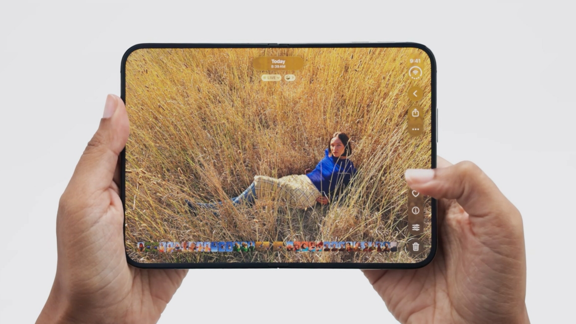
Apple made a smart move to use a nano-texture finish on its inner foldable display. The same treatment as the iPad Pro and the Pro Display XDR. It scatters reflected light instead of bouncing it back on the panel. As a result, the crease stops being as visible as on other foldable phones on the market.
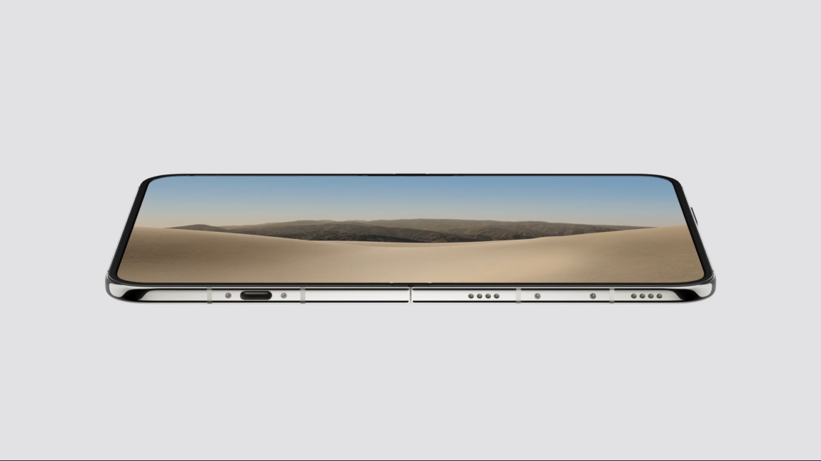
Even Apple's head of marketing, Greg ‘Joz’ Joswiak, talked about how they kept adding security to the nano-texture finish so it wouldn't leak to its competitors in an interview with Tom's Guide. Of course, the crease is still there, but only visible if you go searching for it.
Related Articles

Apple Hid the Selfie Camera Under the Screen
Apple also did something I didn't expect from their first-generation foldable. It put the inner selfie camera under the display. As you might have seen from the videos out there, there is no cutout for the selfie camera on the 7.6-inch panel.
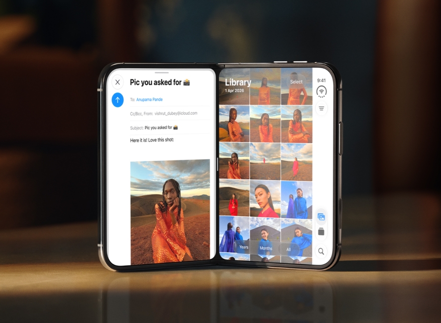
The camera sits under the display, creating an illusion of an uninterrupted screen. It isn't new, as Samsung attempted under-display cameras in its foldables before and abandoned them after the Galaxy Z Fold 6 because of poor image quality. But I think Apple is prioritising looks over camera quality.
Related Articles

The Little Things Make the iPhone Duo Special
Apple has also paid keen attention to how one would use the iPhone Duo and redesigned the entire interface around it.
Lock Screen controls, app navigation, and the Home Screen dock have all moved to the right, and the dock is now vertical. The Dynamic Island has been rotated to run down the side of both displays, and then there is the new status bar.
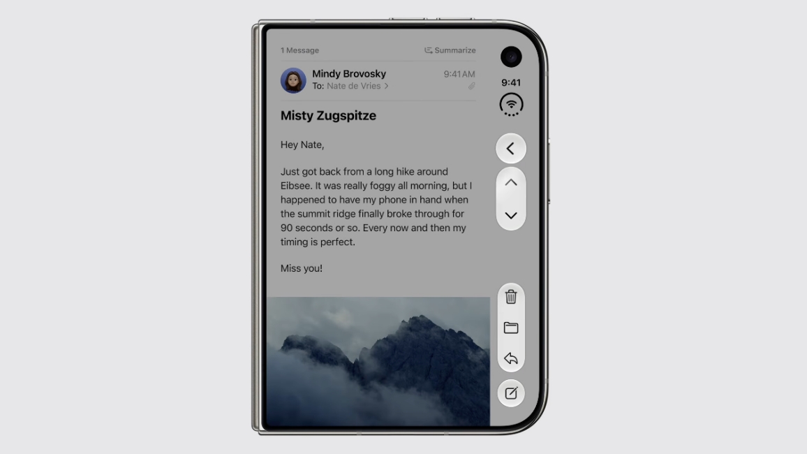
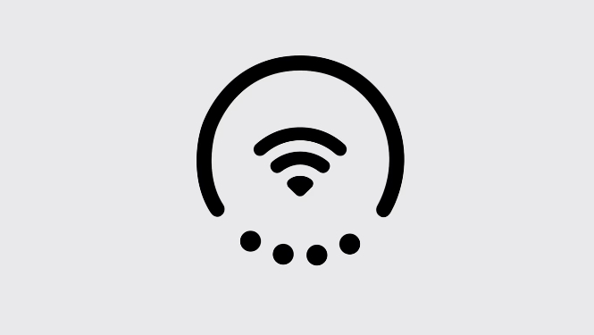
Wi-Fi, network and battery icons are compressed into a single circle, with Wi-Fi in the middle, dots around it for signal strength and a ring for battery. It takes up almost nothing, and it looks fantastic.
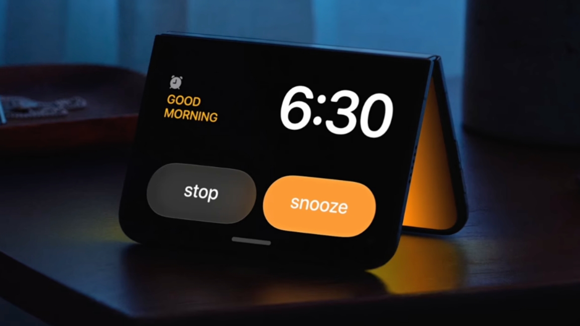
StandBy also got reworked. Fold the iPhone Duo into a tent, and it becomes a bedside display even when it is not plugged in, with a new alarm clock that glows softly off the main screen.
Related Articles

iPhone Duo Just Won the Aesthetics Game
Whoever worked on these animations at Apple must be patting themselves on the back after seeing the response.
It won't long before brands and developers try to replicate the animations, status bar circle, or the standby effect. It wouldn't be far-fetched to say that we might see a lot of similar, if not the same, effects come to Android phones next year. That is how this usually goes.
For now, though, Apple has won the aesthetics game outright with the iPhone Duo, and it has done it before a single Duo has shipped to consumers. We will have a lot more to say once we get the phone in October. So stay tuned for that.
Related Articles


